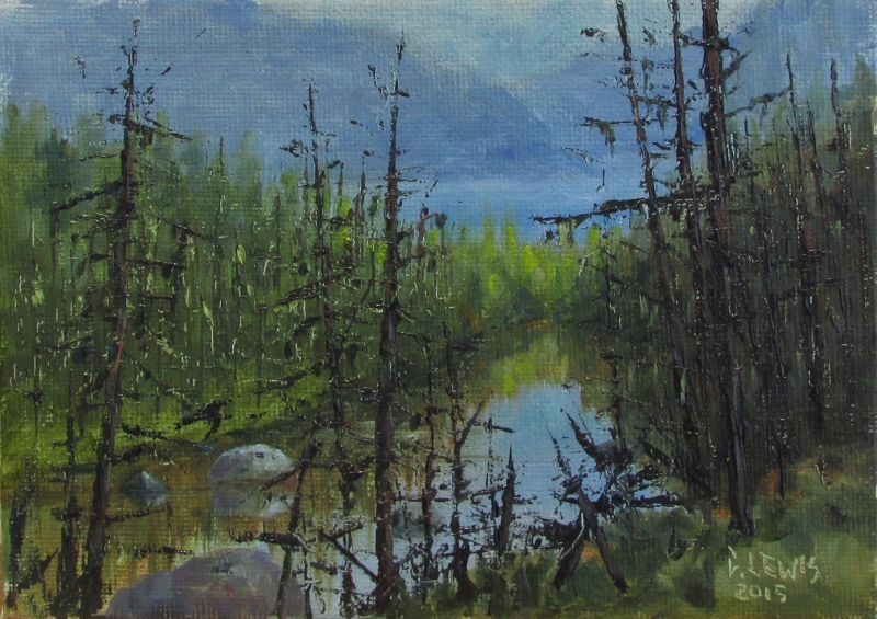
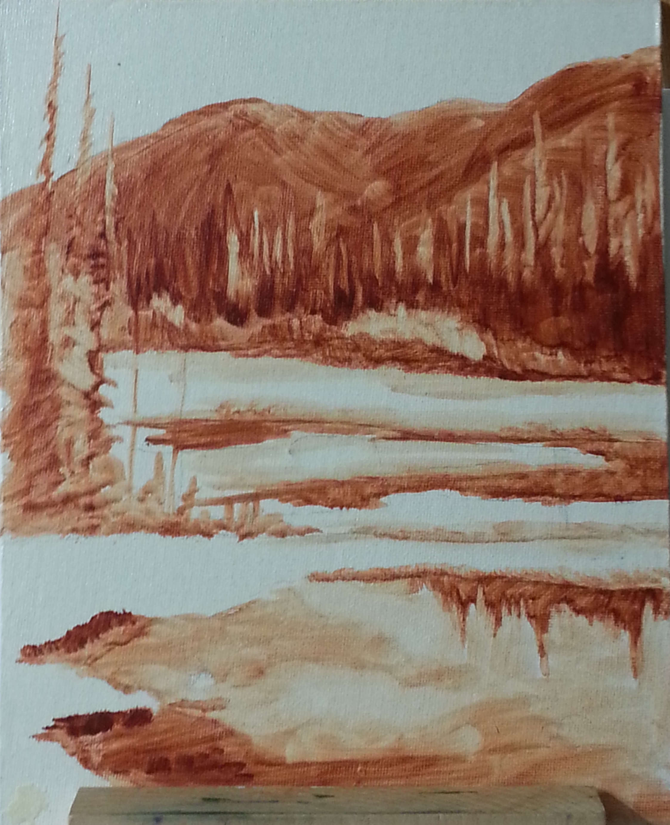
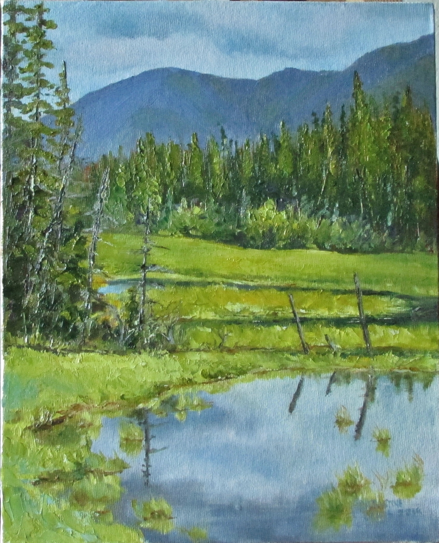
I am actually quite taken with this little painting. There is something very pleasing about its simplicity. To try a painting using just one color is a great process for beginners. I even think that this practice is helpful for more advanced painters. This is useful In many ways… like helping one to recognize the values in the painting. After doing this you could more easily adjust your values to emphasize different areas of interest or intensity. This can also help one to see the unnecessary details of their subject. This is also good practice for how one might do an underpainting of their subject. Many artists will do a complete, thinned down, two tone painting like this before they add their color. That way they can concentrate on adding color without thinking about the value as well. This is often helpful when the subject matter has a lot of detail. But this is not a necessity, just a matter of preference. I have done some of these underpaintings and found them very helpful. But there are many times that I just want to be more spontaneous.
(as a side note, this post should have come before the last one) I would be interested to hear about anyone else’s experience with this process as well.

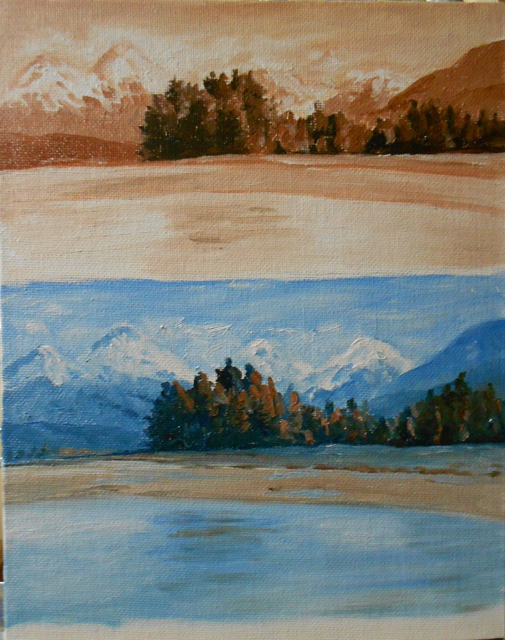
 This was really enjoyable to do. I’ve done a few sunsets now and struggled with them more. This one came together a bit easier. It’s very simple but a sunset is always best, in my opinion, when kept on the simple side. I like how it reads a little differently depending on the light coming into the room.