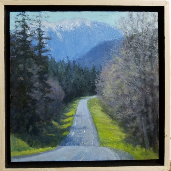
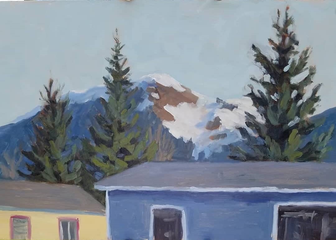
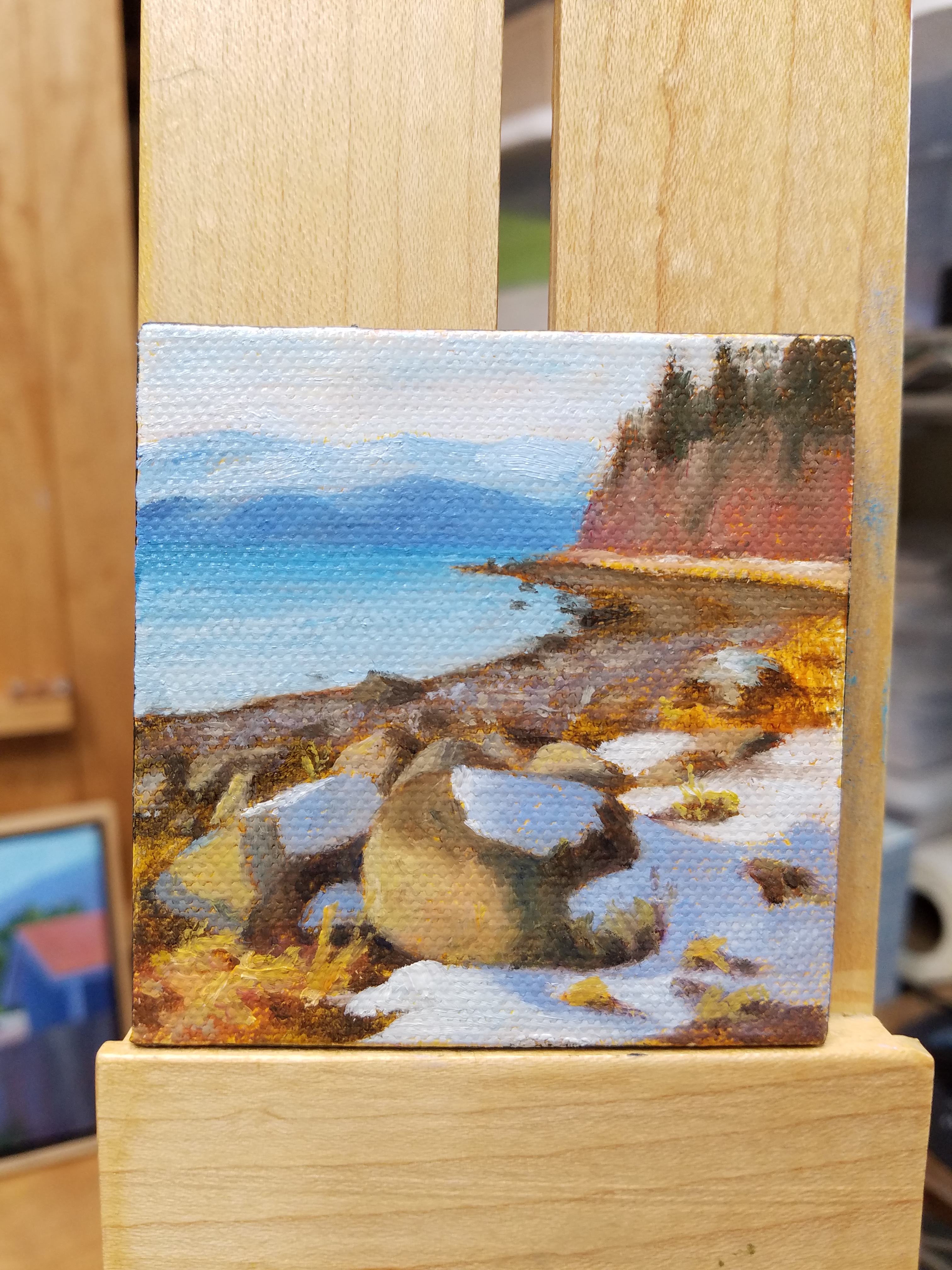
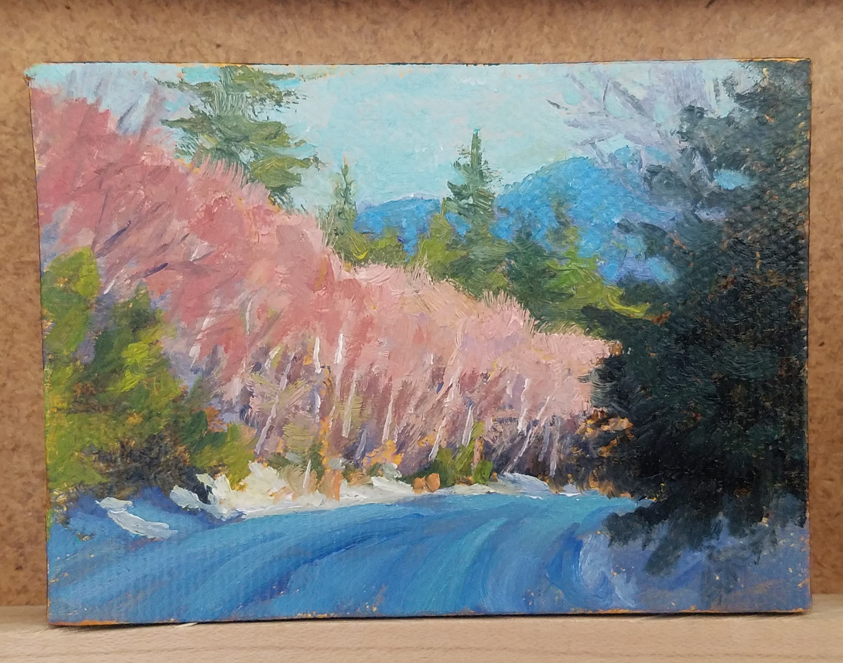
This is an example of what I sometimes do…this has been a favorite 8×10 painting that I did several years ago (the one on the right is the first edition). I think it was one of the first times that I really tried to push my colors to be brighter and bolder than what I was seeing in my reference pic. As I have gotten older, I have come to enjoy that brighter array of color rather than all muted tones. So I really liked leaving this bright.
As time went on, I wanted to tone it down just a little, and play with some of the techniques that I had learned regarding color schemes. I have to say I am very happy with the results. Do you have a preference?