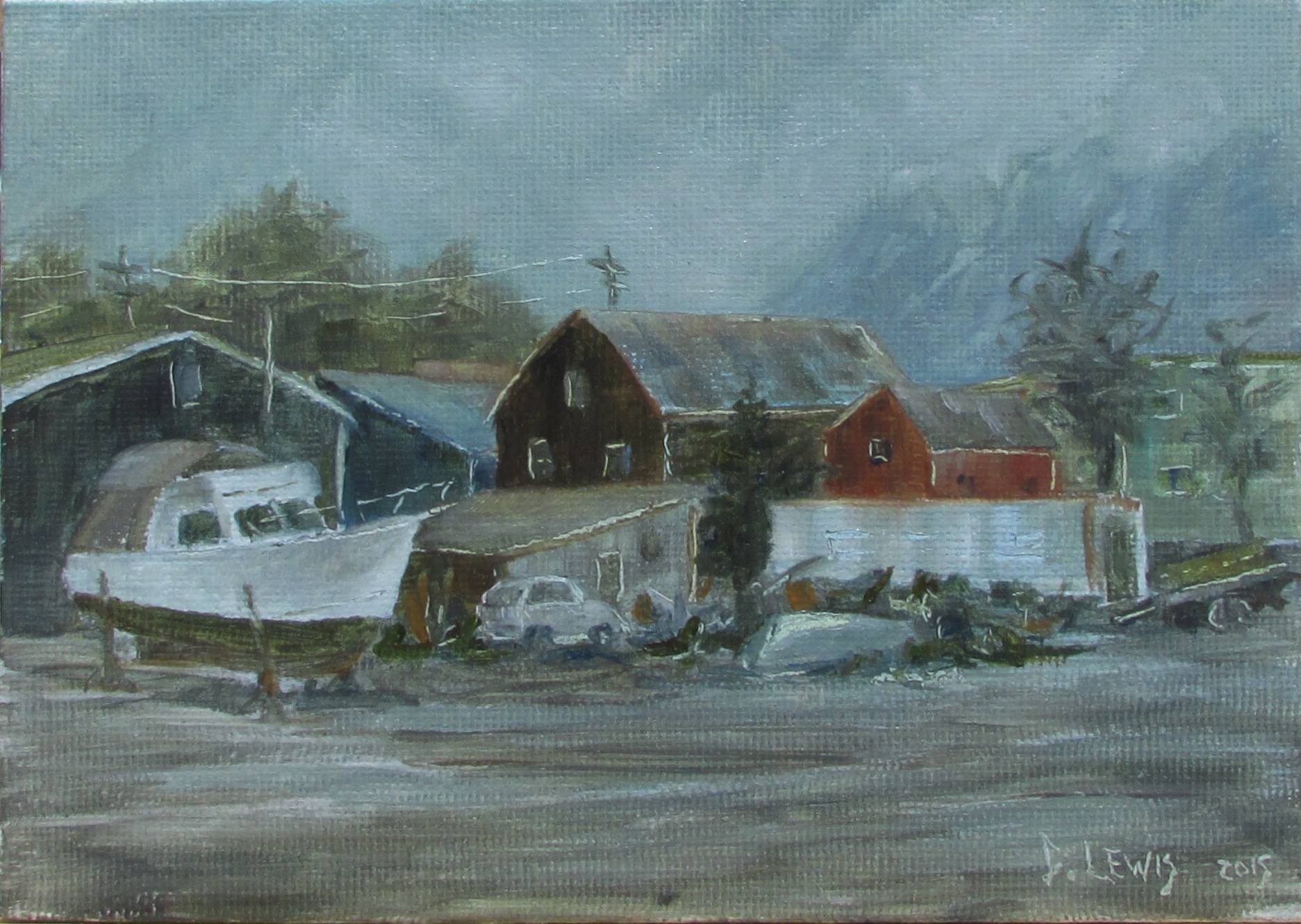
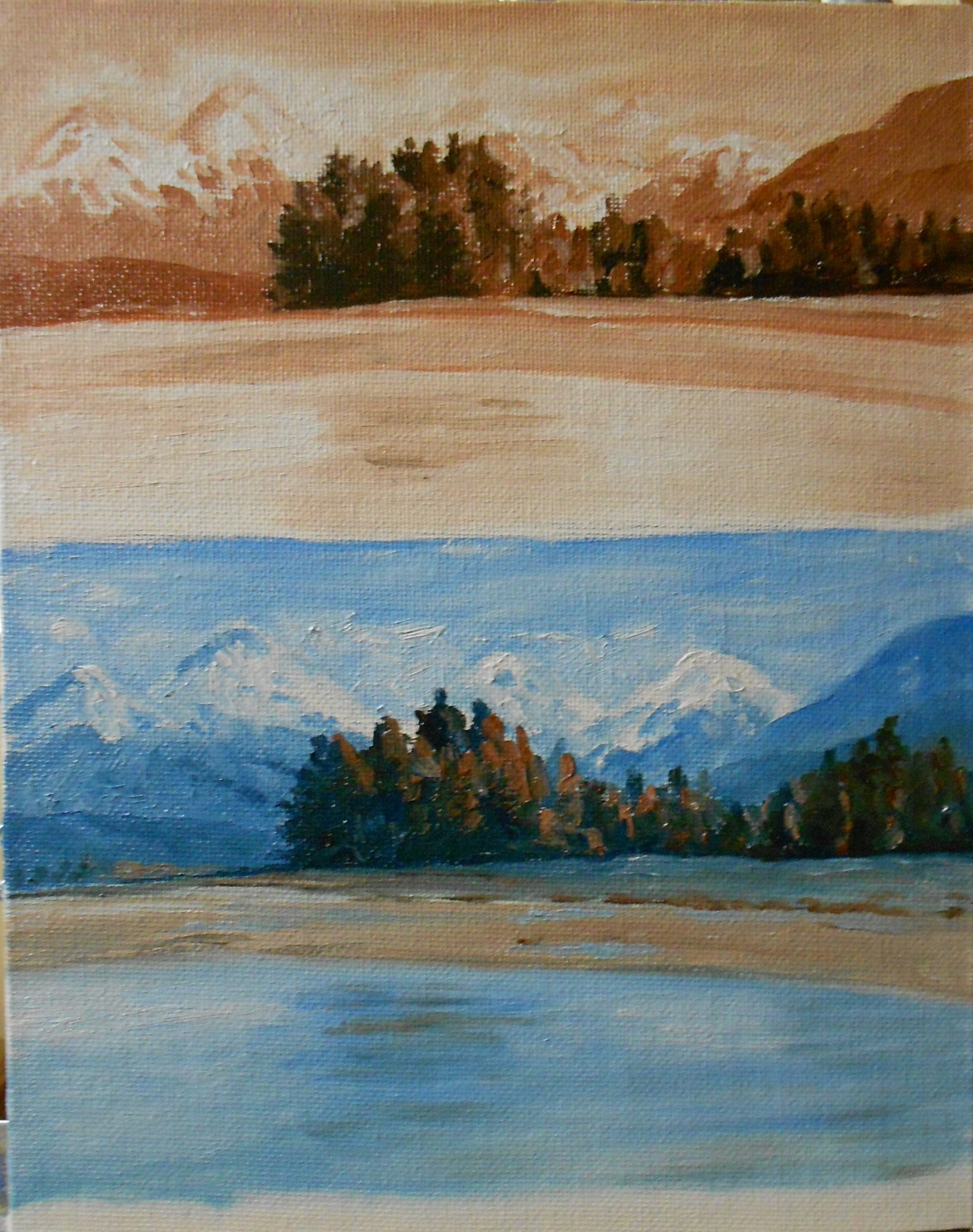
This is an 8×10 oil painting done from a photo I took down in Cohassette, MA while visiting my parents. On this particular day it was misty and overcast. I wanted to try painting this because of those weather conditions. It is very different to paint bright sunny day as opposed to a gray overcast day. It takes practice to see things in different light. I think that this is why I like to paint. I like the challenge of portraying the certain feeling a scene takes on in different lighting conditions. I really spend a lot of time observing the changes in light and shadow as well as colors under different conditions. It is really amazing to me.
Category Archives: study
Buoy’s Glow
This is a 5×7 oil painting. I took the photo used for this on the back of our boat. It was early morning and the sunlight was extremely low and intense. In this study I was trying to work on creating the intense glow of the bright orange buoy. It fascinated me to see how much it cast its brightness onto the surrounding items. I did a workshop last year where we were challenged to do the same thing. My results on that painting were not quite as successful as this one. I definitely learned a few things from that workshop. This is just another example of how it can be very helpful to do the same picture more than once, or at least something very similar.
Evening Color
This was really enjoyable to do. I’ve done a few sunsets now and struggled with them more. This one came together a bit easier. It’s very simple but a sunset is always best, in my opinion, when kept on the simple side. I like how it reads a little differently depending on the light coming into the room.
Douglas Harbor
I have been wanting to do this for a while. I liked it because I tried something new and used a gray-blue toned canvas, to help with the gray mood of this day. Juneau is very rainy, so this mood is very typical. Something about that, as well as the conglomeration of buildings and objects made me want to paint this scene. I am definitely drawn more to a strong, sunny scene, but I would like to be able to capture different types of weather and light conditions.
Another Underpainting Example
I thought I would show another example of an Underpainting, because when I first started painting I couldn’t get enough information about the different ways that people choose to paint. I enjoy seeing how other people paint…it gives me ideas and may lead to better things. It’s good for us to know that there is not just one way to do things. Rather there are a vast number of ways to do the same thing! I think this is very helpful to know. Actually, I think this little painting is the very first time that I tried doing an Underpainting. You can see just how much detail I included in the early stages.
I’m sure this may be old news to many people, but I can remember how fascinated that I was with it early on. So I wanted to do a few posts to show any beginners how they might try it.
Detailed Underpainting
This is an example of a two tone Underpainting where it was extremely necessary. I felt like there would be no way for me to keep track of my distant trees without a basic guide layer down first. This gave me a clear idea of my values before I started and also acted like a map for me to keep from having my trees get lost in the forest (so to speak). You can see that an Underpainting can be quite vague or extremely detailed. It is very interesting to play around with.
Back to Basics
I am actually quite taken with this little painting. There is something very pleasing about its simplicity. To try a painting using just one color is a great process for beginners. I even think that this practice is helpful for more advanced painters. This is useful In many ways… like helping one to recognize the values in the painting. After doing this you could more easily adjust your values to emphasize different areas of interest or intensity. This can also help one to see the unnecessary details of their subject. This is also good practice for how one might do an underpainting of their subject. Many artists will do a complete, thinned down, two tone painting like this before they add their color. That way they can concentrate on adding color without thinking about the value as well. This is often helpful when the subject matter has a lot of detail. But this is not a necessity, just a matter of preference. I have done some of these underpaintings and found them very helpful. But there are many times that I just want to be more spontaneous.
(as a side note, this post should have come before the last one) I would be interested to hear about anyone else’s experience with this process as well.
Gesso board with Pallet Knife
This is my second painting on gesso board. I also used a pallet knife. I deliberately kept this loose. These low tide scenes where you can see beach forever always appeal to me. So I just thought I would do something a bit different. You can probably see that I don’t have one favorite subject yet. I am enjoying the learning process and trying all types of subjects as well as different light.
Second Attempt of Lincoln Island Rock
I think that the first painting was too cool. I did add a bit of warmth to it but thought that I would try it again. You know that ‘repeat, repeat’ thing. ( = Well for this one I also used a canvas that was toned with burnt sienna. If you remember, the first one was toned with a pale blue hue. I do believe that this one came out much warmer simply because I started out with a warm undertone. The blue of the last one was strong enough to influence my whole painting so that it leaned toward very cool in the end.
Usually my preference is for a warm painting, but I do like the idea of trying different things to see where it leads. So I learned from this…I can either be very careful to warm all my colors if I use a cool toned canvas, or I can start with a warmer tone. I have seen paintings of fog or overcast days that have been done on a blue/ gray canvas that I really liked, but again, I will practice. In the end, I really prefer this warmer painting.
Pond Reflections
This is a little 5×7 that just looked like a challenge with all the foliage and the upside down reflections. You can almost turn it upside down to display it as well. ( = I am finding that greens can be a challenge, especially when there are so many different shades in one painting. This is probably another thing I could practice…the many different greens.