6 Minis

6 minis
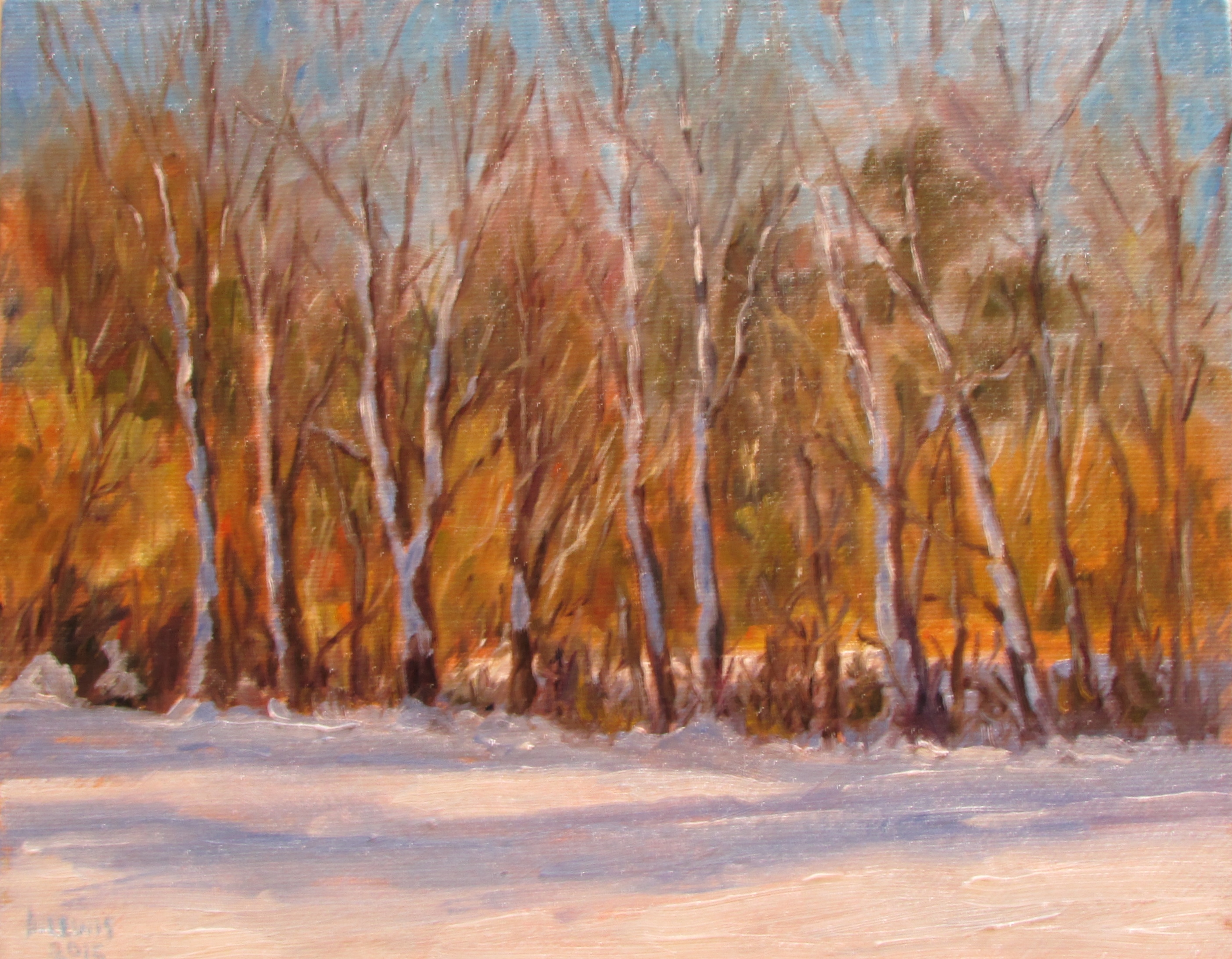
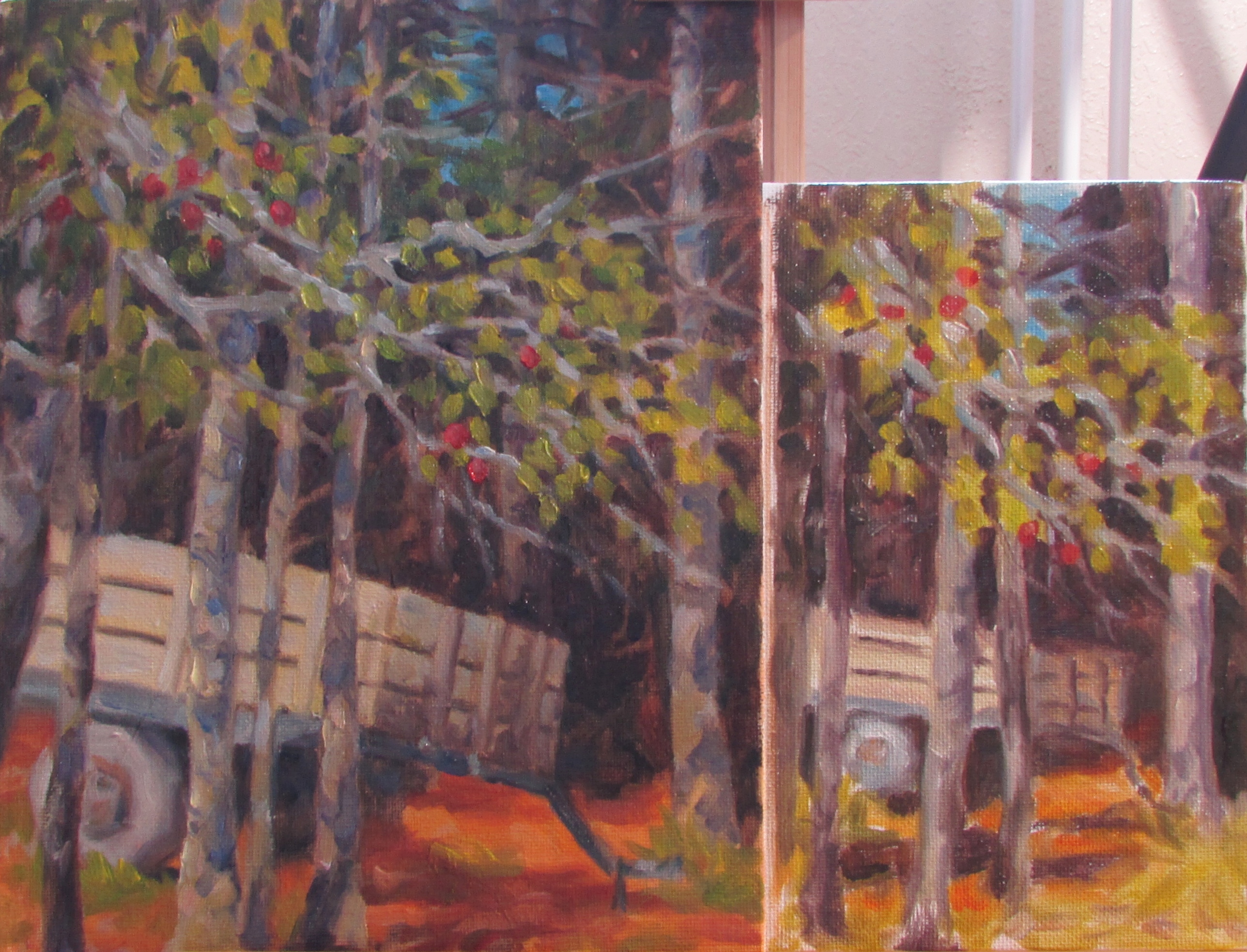
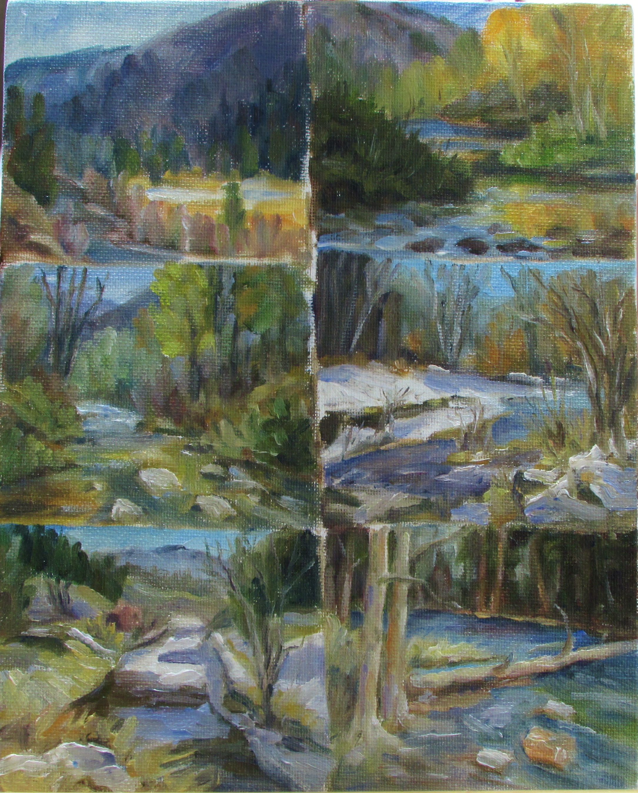
This is a collection of 4×4 paintings that I did this week. They are copies of larger paintings by a friend who’s work I particularly like. His brush strokes are quick and sketchy and his paint is quite thick and textural. Another thing I like about it is his color choices. He uses a few different colors than I was using and I enjoyed adding these to my pallet. (the new ones were sap green, cad orange light, and yellow ochre)

I really enjoyed these little studies. I got a feel for the look and light, as well as a bit more texture. I think this was very helpful.

Paintings of my struggle

morning light (2) morning light (1)

So these are 2 of the paintings I did as I struggled this week. When I edited the colored one and looked at it in black and white it was not too far off from this one on the left that I painted in one color.  I have yet to be successfull with this painting, but I thought I would show you where I am coming from. I will continue to try capturing this to my satisfaction, but probably not today ( =

Struggles

This week has been one big struggle when it comes to my painting! I took a photo of a beautiful spot last fall. The setting is of a waterfront area early in the morning. There was bright, warm, low sun shining on the shoreline making the dried grasses glow in the warmth. In contrast, the shadows were a beautiful cool blue.

I have been eager to put this into a painting and be able to capture that wonderful contrast. So this week I have painted that one scene no less than 10 times, perhaps more. Each one has been dreadfully unsuccessful! I tried everything, from quick little sketchy paintings, to full blown effort, all with no success.  Finally I decided to take a step back and do a value study using a single color. (Almost like a black and white). This proved to be helpful in showing how close the colors were in value, but it did not help me to get the colors correct. I guess I will just have to go back to it another day and try again.

Working on creating the feeling of distance

Eagle crest Water 2This is a painting of our ski area in Juneau called Eagle Crest. It is a beautiful place to hike. I love the warm colors and the reflections in the water. I wanted the dark area in the distance to look more shaded from the sun than it does, I need to work on that. But this was a fun painting to do. (It is 8×10)

Quick Study?

TrailerCan you guess which of these took 15-20 minutes, and which one took almost a full day? Well, I wanted to do this to prove that a painting can be done quickly and effectively. In this I wanted to capture the essence of the scene; like the light vs. darks and the general layout, and perhaps notes of color. The larger one took most of a day. It really is not that much more detailed than the other. They both capture the scene. I  could work on the smaller one more, but this is all I needed it to tell me right now. I think this is a very valuable skill to learn well. I will be doing much more of this quickk study to see what I can do with it. I would not consider the larger one a complete painting, but I was at a point of overworking it and decided I had messed with it enough. I will try it again another day.