Another Underpainting Example

z left overs (89)z left overs (90)

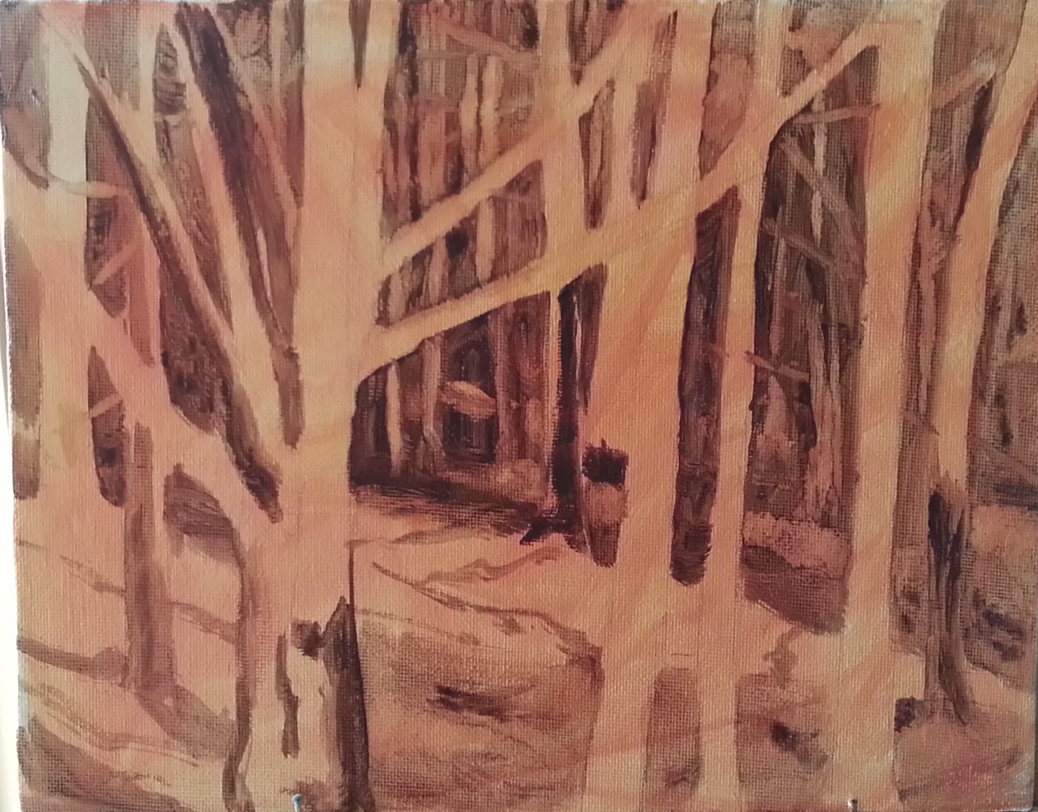
I thought I would show another example of an Underpainting, because when I first started painting I couldn’t get enough information about the different ways that people choose to paint. I enjoy seeing how other people paint…it gives me ideas and may lead to better things. It’s good for us to know that there is not just one way to do things. Rather there are a vast number of ways to do the same thing! I think this is very helpful to know. Actually, I think this little painting is the very first time that I tried doing an Underpainting. You can see just how much detail I included in the early stages.

I’m sure this may be old news to many people, but I can remember how fascinated that I was with it early on. So I wanted to do a few posts to show any beginners how they might try it.

Detailed Underpainting

Maine woods (3)Maine Woods


This is an example of a two tone Underpainting where it was extremely necessary. I felt like there would be no way for me to keep track of my distant trees without a basic guide layer down first. This gave me a clear idea of my values before I started and also acted like a map for me to keep from having my trees get lost in the forest (so to speak).  You can see that an Underpainting can be quite vague or extremely detailed. It is very interesting to play around with.

Pond Reflections

IMG_8019This is a little 5×7 that just looked like a challenge with all the foliage and the upside down reflections. You can almost turn it upside down to display it as well. ( =  I am finding that greens can be a challenge, especially when there are so many different shades in one painting. This is probably another thing I could practice…the many different greens.

Playing with colored canvas

Lincoln Island BeachThis little canvas was underpainted with a pale blue hue. I think this was the first time trying blue. I liked it a lot. The overall tone of the painting came out cool even though it was a very sunny scene. After taking this photo I did tone down the blueness of the rocks in the shade. It was a little too blue for me. But I really enjoy painting on a canvas that is underpainted because it gives you a mid tone color to start with which can help you read your colors better. It is also interesting to play around with little bits of color you leave showing. If I did this same painting with the pale orange underneath, it would have taken a totally different direction. I’m almost interested enough to try that in order to compare the two.

Many people know exactly how they intend their painting to turn out. At this point for me, I sort of let it tell me where it is going to go. I try to read it as it progresses and see how it feels. That part is still fun for me. If I have a direction in mind and it doesn’t go that way, well that will be frustrating. But for now I am learning what may cause certain outcomes. And I am enjoying the process!

Sunny Bend

Auke Rec PointI continue to find trees extremely challenging yet I am seeing progress. It is a challenge to know where to begin some of these pictures of the woods, but I felt like I at least had some direction this time. I still feel like this could be improved on if I did it again, but I’m happy with it for now. I’m still feeling a strong attraction for painting woodland scenes and especially trees themselves, in fact I found a guy that paints ‘tree portraits’ yesterday on Pintrest. His name is David Langevin. His stuff is amazing. It may be a similar direction I’d like to go in eventually. You can check out his work on whiterockgallery.com. Just search his name.

Red Evening Light

Sunset PeaksThe intense pink on the white peaks here shows how red the evening light can be. Everything else around was almost black and white but the light reflecting on the mountain is red. I see this often here in Juneau on the mountains, and I wanted to get it down on canvas so I remember the strength of the color.

Orange Mountains?

Mountain sunsetThis is another 5×7, also a view from my front yard. The low sun in the winter is spectacular when it comes out. The mountain is green with trees, of course, but the warm sun makes them appear orange in the evening. I wanted to capture this extreme color compared to the cool sky and snow for later reference.  Sunshine makes me smile! ( =

Sunny Spot

Sunny SpotThis is a view from my home. There is a mountain that goes straight up just across from us. The way the sun hits it in the evening amazes me. the colors are so strong. I’m not sure how this reads to someone not familiar with the view. But it is supposed to be a patch of the mountainside just catching the sun between the dense foggy patches.

Tree Study

Tree StudyI love painted trees! I need to practice them close up because they are very tricky to paint. So in this I combined the tree practice with the strong warm light practice. It is just a small 5×7, but I think it has good impact. When studying a subject close up, the things you learn can be easily applied to a more suggestive painting later on. This is another thing that I need to remember.