Mendenhall Loop Road

Loop Road Juneau, AK (800x572)I really enjoy small town scenes like this. I have never felt adept at painting them but this shot made me want to give it a try. The view of Mendenhall Glacier on our road is spectacular. On this particular day, my husband was driving and it allowed me to get a good shot. I think it is always appealing for local people to see a familiar scene. I like how this one worked out.

One More Underpainting

Into the woods (3)IMG_7703

This will be my final example for now of how useful a more detailed Underpainting can be. This is another wooded scene where my trees could easily have all gotten lost or run together as I went along. By having my Underpainting sort of map out my values, it was much easier to keep track of where my trees were separated. This also was helpful for me to see whrere it was important to perhaps place a darker tree next to a lighter one in order to distinguish it or make it more focal. It really is nice to be able to play around with your composition and value at this point before you have invested too much time. For me, it is invaluable when the painting has much detail.

Back to Basics

z left overs (60)I am actually quite taken with this little painting. There is something very pleasing about its simplicity. To try a painting using just one color is a great process for beginners. I even think that this practice is helpful for more advanced painters. This is useful In many ways… like helping one to recognize the values in the painting. After doing this you could more easily adjust your values to emphasize different areas of interest or intensity. This can also help one to see the unnecessary details of their subject. This is also good practice for how one might do an underpainting of their subject. Many artists will do a complete, thinned down, two tone painting like this before they add their color. That way they can concentrate on adding color without thinking about the value as well. This is often helpful when the subject matter has a lot of detail. But this is not a necessity, just a matter of preference. I have done some of these underpaintings and found them very helpful. But there are many times that I just want to be more spontaneous.

(as a side note, this post should have come before the last one) I would be interested to hear about anyone else’s experience with this process as well.

Gesso board with Pallet Knife

IMG_8383This is my second painting on gesso board. I also used a pallet knife. I deliberately kept this loose. These low tide scenes where you can see beach forever always appeal to me. So I just thought I would do something a bit different. You can probably see that I don’t have one favorite subject yet. I am enjoying the learning process and trying all types of subjects as well as different light.

Gesso Board Trial Piece

First Pic on GessoThis is a 6×6 painting, and it is the first painting that I have done on Gesso board. I have been wanting to try this since my first post. I read in Carol Marine’s book that she uses it and likes it. There are several artists whose paintings have a smooth flowing brush stroke style and I have been unable to get that in my paintings. It seems like they must either use gesso board or a smoother canvas than I do. To save on cost, I have given into using an inexpensive canvas board most of the time for these small practice pieces. But it does not help to practice what doesn’t work for you. I need to begin either using Gesso board or prepping my canvas in a different way to create a smoother finish. I have recently found another brand of canvas board that is not too expensive and does have a wonderful smooth coating. (the brand is Art Advantage) I cannot get it here in Juneau, and shipping is always expensive to Alaska so I have not used it on a regular basis. But I am beginning to think I should. I will have to get a bunch when I travel back to Maine next month.

Anyway, I did enjoy the Gesso board. It is a little tricky to learn a lighter touch with the brush so you don’t pull paint off with a second stroke, but I especially like that the brush strokes remain visible. This is merely a preference, and many people do not like this look. I do look forward to playing around with it more.

Second Attempt of Lincoln Island Rock

IMG_8376
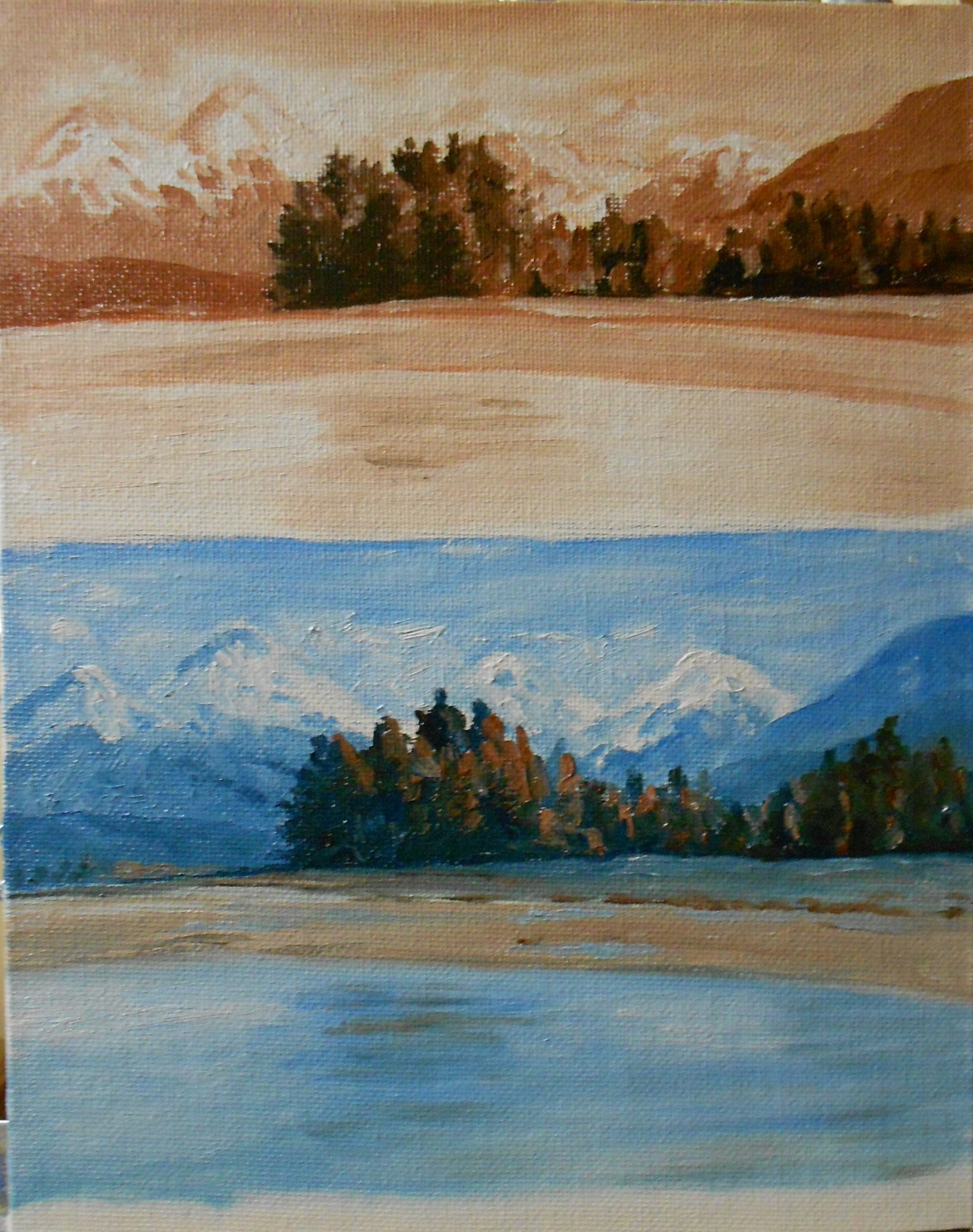
I think that the first painting was too cool. I did add a bit of warmth to it but thought that I would try it again. You know that ‘repeat, repeat’ thing. ( =  Well for this one I also used a  canvas that was toned with burnt sienna. If you remember, the first one was toned with a pale blue hue. I do believe that this one came out much warmer simply because I started out with a warm undertone. The blue of the last one was strong enough to influence my whole painting so that it leaned toward very cool in the end.

Usually my preference is for a warm painting, but I do like the idea of trying different things to see where it leads. So I learned from this…I can either be very careful to warm all my colors if I use a cool toned canvas, or I can start with a warmer tone. I have seen paintings of fog or overcast days that have been done on a blue/ gray canvas that I really liked, but again, I will practice. In the end, I really prefer this warmer painting.
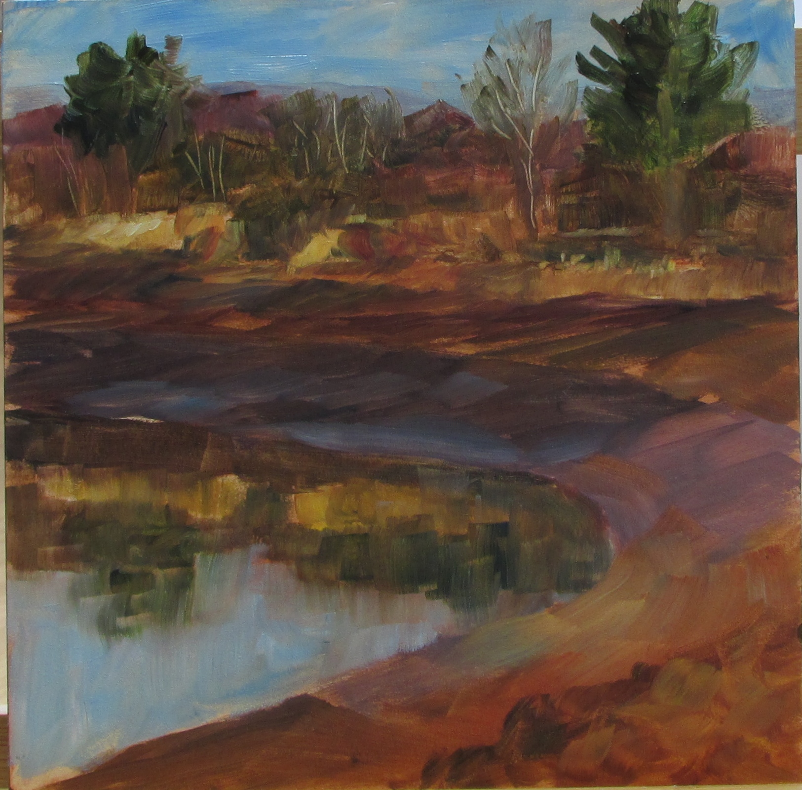
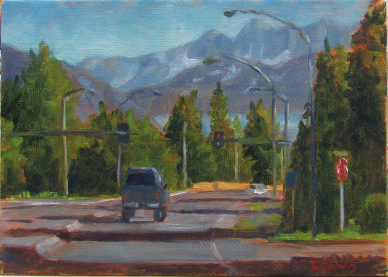
Pond Reflections

IMG_8019This is a little 5×7 that just looked like a challenge with all the foliage and the upside down reflections. You can almost turn it upside down to display it as well. ( =  I am finding that greens can be a challenge, especially when there are so many different shades in one painting. This is probably another thing I could practice…the many different greens.

Playing with colored canvas

Lincoln Island BeachThis little canvas was underpainted with a pale blue hue. I think this was the first time trying blue. I liked it a lot. The overall tone of the painting came out cool even though it was a very sunny scene. After taking this photo I did tone down the blueness of the rocks in the shade. It was a little too blue for me. But I really enjoy painting on a canvas that is underpainted because it gives you a mid tone color to start with which can help you read your colors better. It is also interesting to play around with little bits of color you leave showing. If I did this same painting with the pale orange underneath, it would have taken a totally different direction. I’m almost interested enough to try that in order to compare the two.

Many people know exactly how they intend their painting to turn out. At this point for me, I sort of let it tell me where it is going to go. I try to read it as it progresses and see how it feels. That part is still fun for me. If I have a direction in mind and it doesn’t go that way, well that will be frustrating. But for now I am learning what may cause certain outcomes. And I am enjoying the process!

Soft Low Light

Juneau ViewThis is a view looking down the channel towards Downtown Juneau and the Juneau/Douglas Bridge. I made a stop on the side of the road, probably where one really shouldn’t stop, but I just had to get a few shots of this beautiful scene! One thing that I learned and applied here is to paint the sky and then make extra of that color. Then use that color to blend into the mountains to give you that nice atmospheric look. It is much better than just adding white. It unifies the whole thing much better. I am looking forward to doing this on a larger canvas very soon.

Sunny Bend

Auke Rec PointI continue to find trees extremely challenging yet I am seeing progress. It is a challenge to know where to begin some of these pictures of the woods, but I felt like I at least had some direction this time. I still feel like this could be improved on if I did it again, but I’m happy with it for now. I’m still feeling a strong attraction for painting woodland scenes and especially trees themselves, in fact I found a guy that paints ‘tree portraits’ yesterday on Pintrest. His name is David Langevin. His stuff is amazing. It may be a similar direction I’d like to go in eventually. You can check out his work on whiterockgallery.com. Just search his name.