Playing with colored canvas

Lincoln Island Beach
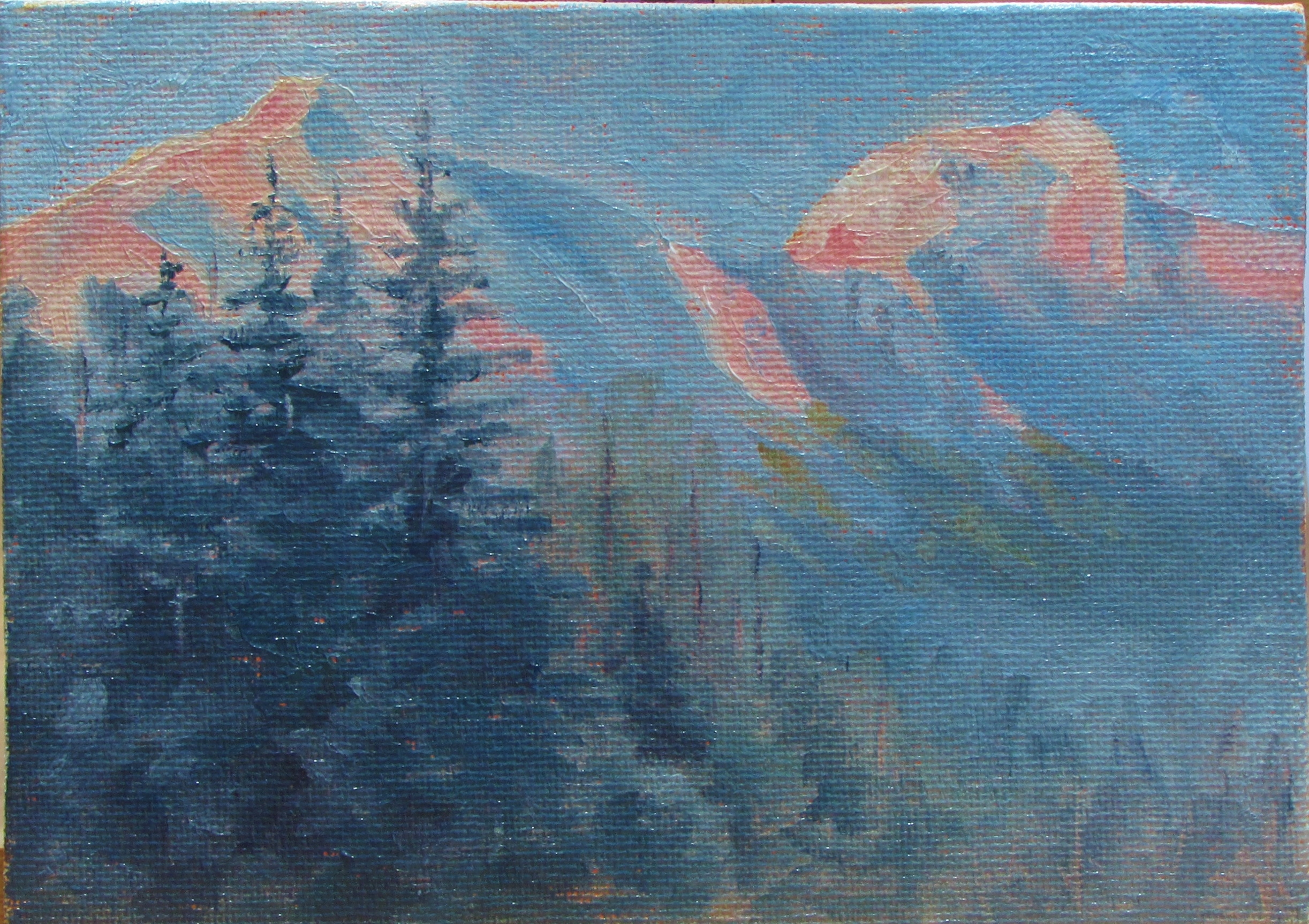
This little canvas was underpainted with a pale blue hue. I think this was the first time trying blue. I liked it a lot. The overall tone of the painting came out cool even though it was a very sunny scene. After taking this photo I did tone down the blueness of the rocks in the shade. It was a little too blue for me. But I really enjoy painting on a canvas that is underpainted because it gives you a mid tone color to start with which can help you read your colors better. It is also interesting to play around with little bits of color you leave showing. If I did this same painting with the pale orange underneath, it would have taken a totally different direction. I’m almost interested enough to try that in order to compare the two.

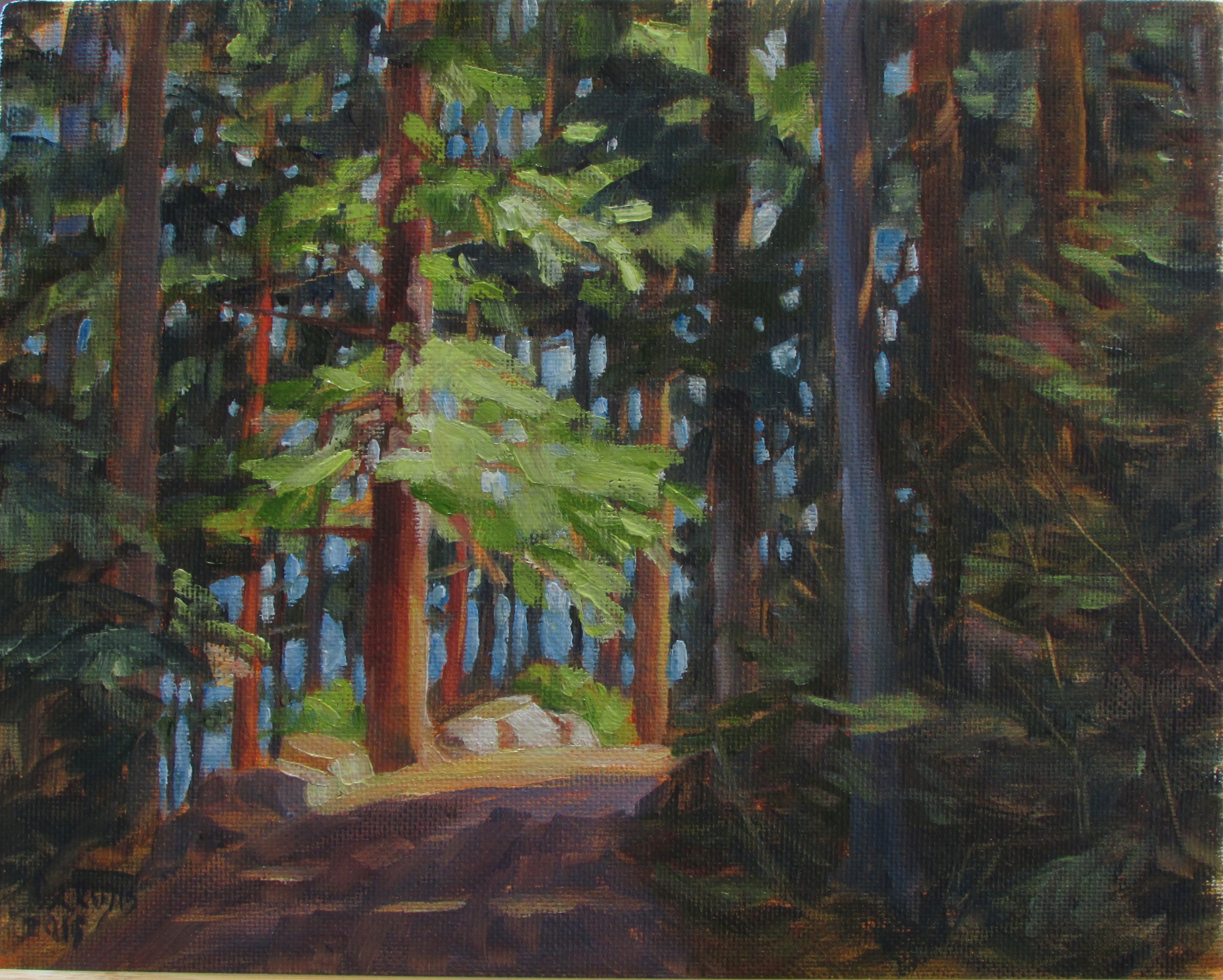
Many people know exactly how they intend their painting to turn out. At this point for me, I sort of let it tell me where it is going to go. I try to read it as it progresses and see how it feels. That part is still fun for me. If I have a direction in mind and it doesn’t go that way, well that will be frustrating. But for now I am learning what may cause certain outcomes. And I am enjoying the process!

Snow Practice

Corinth SnowThis is a scene from Corinth, Maine. It is a very farmy town where my friend lives. I love to take photos out there of the farms and countryside. It is open and always has nice lighting effects. This one was interesting to me because of the big old Maple trees and because of the snow. I still need to add a few lines on the poles when it dries, but this was fun.

This one was also an example of that pale orange underpainting bleeding into the snow. I had to do a couple layers. But you can also see areas where it gives an interesting warm glow through the trees. Depending on the subject matter, you can leave more or less of it to show through.

Trying New Things

IMG_8014I have been trying different underneath colors on my canvases lately. I am finding that I really like the effects of a pale warm orange (actually a combination of Cad Red Mid and Cad Yellow, and maybe a touch of White). I have been thinning this down quite a bit with  mineral spirits so that it is a very transparent layer. I then have to let it dry for several days before using it. there are several reasons to do this kind of underpainting, for one, I really like the little areas where it peeks through and creates interest and a glow, as well as a warmth. It also tends to unify and harmonize the painting.

I am finding that this process is not always good for certain subjects. When painting a blue sky or white snow, for instance, it tends to bleed through after it dries, turning your colors toward pink or muddying them up. There are times that this can be an interesting brightness but many times it has to have a second coat to cover it. One thing I am going to try is an acrylic mix so that it will be thoroughly dry before painting with oils.

As a side note, these handy little stands were made by my handy husband and they work great!

Soft Low Light

Juneau ViewThis is a view looking down the channel towards Downtown Juneau and the Juneau/Douglas Bridge. I made a stop on the side of the road, probably where one really shouldn’t stop, but I just had to get a few shots of this beautiful scene! One thing that I learned and applied here is to paint the sky and then make extra of that color. Then use that color to blend into the mountains to give you that nice atmospheric look. It is much better than just adding white. It unifies the whole thing much better. I am looking forward to doing this on a larger canvas very soon.

Sunny Bend

Auke Rec PointI continue to find trees extremely challenging yet I am seeing progress. It is a challenge to know where to begin some of these pictures of the woods, but I felt like I at least had some direction this time. I still feel like this could be improved on if I did it again, but I’m happy with it for now. I’m still feeling a strong attraction for painting woodland scenes and especially trees themselves, in fact I found a guy that paints ‘tree portraits’ yesterday on Pintrest. His name is David Langevin. His stuff is amazing. It may be a similar direction I’d like to go in eventually. You can check out his work on whiterockgallery.com. Just search his name.

Red Evening Light

Sunset PeaksThe intense pink on the white peaks here shows how red the evening light can be. Everything else around was almost black and white but the light reflecting on the mountain is red. I see this often here in Juneau on the mountains, and I wanted to get it down on canvas so I remember the strength of the color.

Orange Mountains?

Mountain sunsetThis is another 5×7, also a view from my front yard. The low sun in the winter is spectacular when it comes out. The mountain is green with trees, of course, but the warm sun makes them appear orange in the evening. I wanted to capture this extreme color compared to the cool sky and snow for later reference.  Sunshine makes me smile! ( =

Sunny Spot

Sunny SpotThis is a view from my home. There is a mountain that goes straight up just across from us. The way the sun hits it in the evening amazes me. the colors are so strong. I’m not sure how this reads to someone not familiar with the view. But it is supposed to be a patch of the mountainside just catching the sun between the dense foggy patches.

Tree Study

Tree StudyI love painted trees! I need to practice them close up because they are very tricky to paint. So in this I combined the tree practice with the strong warm light practice. It is just a small 5×7, but I think it has good impact. When studying a subject close up, the things you learn can be easily applied to a more suggestive painting later on. This is another thing that I need to remember.